
Flying Tigers review by Michelle Mau of Loud Era
At first glance, the site is pretty spartan, and although the
different links fit into the theme of "Things having to do with Harli's life," I
feel like as a whole the page isn't cohesive, The background is just a solid
color that, while soothing, doesn't add much to the page. Perhaps a subdued
wallpaper-style background of sand with some seashells, and then maybe you could
use an image map to place all the links on Harli's surfboard or something? It's
pretty simple to do and I could help you out with it if you'd like
![]() (I can whip up an idea of how I'm picturing it if my wording is confusing)
(I can whip up an idea of how I'm picturing it if my wording is confusing)
I feel that the dropdown menu might be glitched, because it didn't seem that
what I was clicking was taking me where I expected to go, though maybe it's just
a problem on my end.
Artwise, you've refined your style a lot since years ago when I first reviewed
Shit Happens. You've settled on a style for characters, but sometimes I worry
that your style is confining you too much. Emotions are kind of limited to what
the character can express with their eyebrows and mouths- I'd like to see them
echoed more through body language and other parts of the face when applicable,
if that makes any sense.
I feel that their arms are too spindly for the broadness of their torsos. I will
say that htis has improved in recent pages, and anatomy in general is getting
much better (the stiffness has improved a lot for one thing). Keep working on
sketching dynamic poses, and studying the human form in general, but I think in
particular the arms are what stand out now.
You've gotten to a comfortable place with drawing your characters, but I feel
that backgrounds are still lacking.
On this page, for example, it's as if the world is just this one long strip
of land penetrating a dark blue void. Some trees and other buildings would make
it seem more correct. I understand not wanting to spend loads of time drawing
details in backgrounds, but treating them less as an obligation and more as
something that enhances the world of your characters can make them less
miserable to draw. They seem too empty and barren as it is, and sometimes it
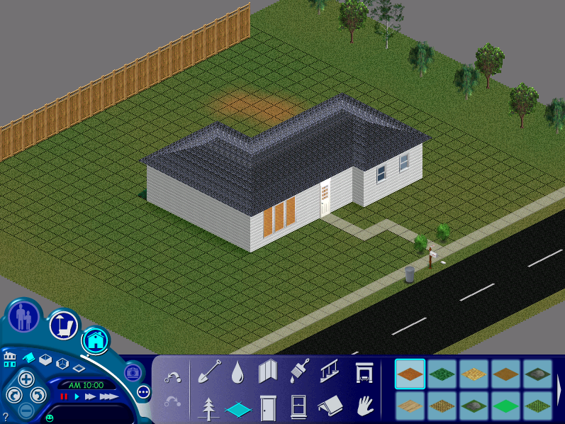
feels like- well, did you ever play the original Sims?
The houses exist on this square plane floating in a gray abyss, like some
bizarre magic carpet over a smoky stormcloud. Really extensive backgrounds don't
need to be used in every panel if that's not what you're going for. I think
Scott McCloud had a bit to say on how detailed to make your backgrounds- check
out his book "Making Comics," as it's pretty helpful in other regards as well.
My last comment on backgrounds is that you vary your line thickness with your
characters, and it's just as helpful to do it with backgrounds. It helps to
convey how large things are as well as how far away they are.
The use of copy/paste, while cutting down production time, does little to help
the feel of the comic. Even if people are sitting and having one continuing
conversation, expressions change, body language changes, people don't just sit
very stoic and still. I don't think you've done this lately though, and if
that's the case then my point is moot.
For organic forms such as the shrubs and grass, I think it would behoove you to
add more details with pen as opposed to giving them texture with marker. Nothing
serious, just defining some of the leaves on the shrubs and some patches of
grass, and then just coloring with a solid color (and adding shadows where
appropriate). I think this would fit better with the rest of your coloring which
tends to be solid and full. Consider adding more details to things like the
surface of water, too, because it isn't all one smooth surface and Harli and the
gang are going to be in there a lot I presume.
My last art issue will be that sometimes speech bubbles seem to be pointing at
the wrong person. [url=http://flyingtigers.comicgenesis.com/d/20120219.html[/url]In
this example[/url], Harli is the one talking but the speech bubble is pointing
at Cara's throat. Even though contextually it makes sense that Harli is talking,
the picture doesn't line up. Here I would place the tail of Harli's speech
bubble over Cara's throat or shoulder somewhat so that there is less visual
confusion.
I know a lot of people have already given you the runaround for the first scene,
so I won't harp on that for a long time. I understand that you want to convey
what happened, but the way it's done and the length of time it goes on for makes
it seem really voyeuristic. I read that you're planning to redo it at some
point, so keep it shorter, maybe even remove the dialogue and thought bubbles.
Then the scene wouldn't be so off-putting (in a way other than how you intend),
and would be taken more seriously.
On the topic of pacing, I feel that the comic moves too slowly. You might choose
to work with more smaller panels as opposed to the current model of a few large
ones.
Here are two
pages that I feel could be combined into one. I don't mean that you would
want to take the second one and just slap it onto the end of the first one, but
more that not much is happening over these two pages and combining them would
help the story move faster. Really try to fit as much information onto every
page as you can. Panels of the characters walking along or looking at things,
when used outside of a suspenseful scenario, draw out the scene unnecessarily
and take away from the story.
My last point is that, so far, the characters don't really stand on their own.
Harli's bubbly and adventurous (though she'd object to the first adjective, but
given how she reacts to really horrible scenarios it's kind of true), the boys
are hapless pervs, Storm is a not-so-hapless perv, Nolan's a good guy, the
Cobras are nasty and gross. But I feel like we should know more about them by
now, we should see other sides to them, deeper things. Really the strongest
quality that anyone has is how perverted they are and how they react to other
people being pervs. In and of itself it's not a terrible characteristic, but it
keeps the story at kind of a sophomoric level and makes it hard to take it
seriously or care too much when the Cobras swoop in to wreak havoc.
Your work has changed a lot since I first reviewed SH back in I think '09? The
story you're aiming to tell is of a different breed, and your art has improved,
and I can understand that due to the problems you have with your hands, drawing
can literally bring you some form or combination of blood, sweat, and tears. I
think you're on the right track, but I think that fixing the pacing and having
more smaller panels per page will help you a lot. You'll have more individual
things to draw, but it'll only be one page of individual things as opposed to
two. And larger panels will still be good when you need them, but for the
general mundane scenarios, smaller ones may suit your work better (and be easier
on your hands- less of a background to draw when you have less space to fill,
and all that!)
The Flying Tigers is copyright © Rob O'Brien 2011-
Flying Tigers is hosted on ComicGenesis, a free webhosting and site automation service for webcomics.